Registered StackHub users may elect to receive email notifications whenever a new package version is released or a comment is posted on the forum.
There are 4 watchers.
This SkySpark extension is a useful tool for quick analysis of energy or HVAC data. The basic principle is similar to pivot tables and pivot plots. User defines columns, rows and fold function. Each cell's value then represents aggregation of all values that belong to the particular cell (e.g. average of all values that were measured on Mondays between 2 and 3 am). There is a function for Carpet plot data calculations and two views: predefined plots and plot studio where you can configure custom plot view in detail.
Three most useful combinations of carpet plots are predefined in this view. User just has to define span, point and fold function. This is a good starting point for new users.
Do not be surprised by different span of color axis. This is a natural consequence of aggregation over different time periods and different number of cells in each plot.
Here you can configure your own carpet plot. For parameters description see Axon funcs tab above.
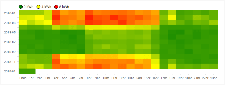
Plots capture average electrical energy consumption during a week. In this case, electricity is used for heating, as can be seen from the first plot (horizontal axis: hour in day, vertical axis: month). There is a clear start and end of heating season.

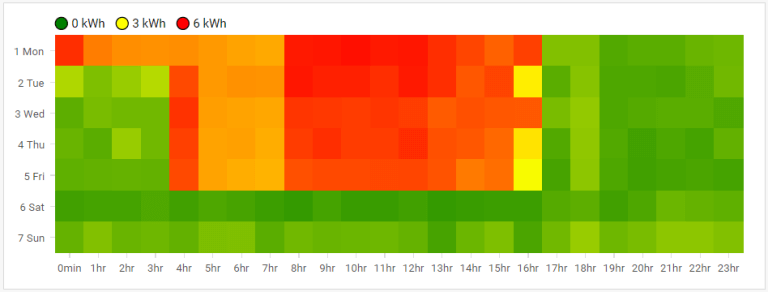
Detailed look at weekly schedule shows that heating starts at 4 am during working days, except of Monday, when it starts at midnight (horizontal axis: hour in day, vertical axis: day of week). There is a clear end of working hours, as expected in case of this office building.

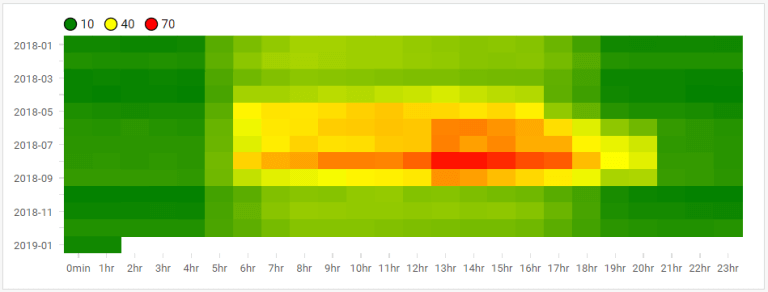
Increase of electrical energy use during summer is usually expected in case of office buildings. Carpet plots are perfect tool for quick evaluation of cooling regimes. This plot is an example of a wrong cooling regime setting. There is an increase of energy consumption during summer, as expected. However, one can observer increase also after opening hours (after 4 pm).

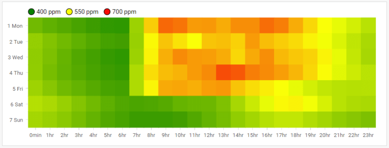
Evaluation of CO2 by means of carpet plot can also provide useful overview. Data from IoT indoor air quality sensor are evaluated in the next example. There is an increase of CO2 concentration during opening hours. Overal CO2 concentrations are ok but slow decrease of CO2 concentrations during evening and night reveals absence of ventilation.

HVAC appliance operation can be investigated by means of carpet plots as well. Bellow is a carpet plot (horizontal axis: day, vertical axis: hour of day) of AHU pressure difference. It shows regular regime with some irregularities at the end of displayed interval. Note that these irregularities cannot be easily found using an usual line chart.

| Version | 1.1.0 |
|---|---|
| License | n/a |
| Build date | 5 years ago on 19th Jun 2020 |
| Depends on | |
| File name | ecpCarpetShopExt.pod |
| File size | 57.35 kB |
| MD5 | deca4927ad802a6bd33702a157f3fdca |
| SHA1 | 4654b14cdf7d07a9293b3ea49670a3269b19b33c |
Published by Energy TwinDownload nowAlso available via SkyArc Install Manager | |